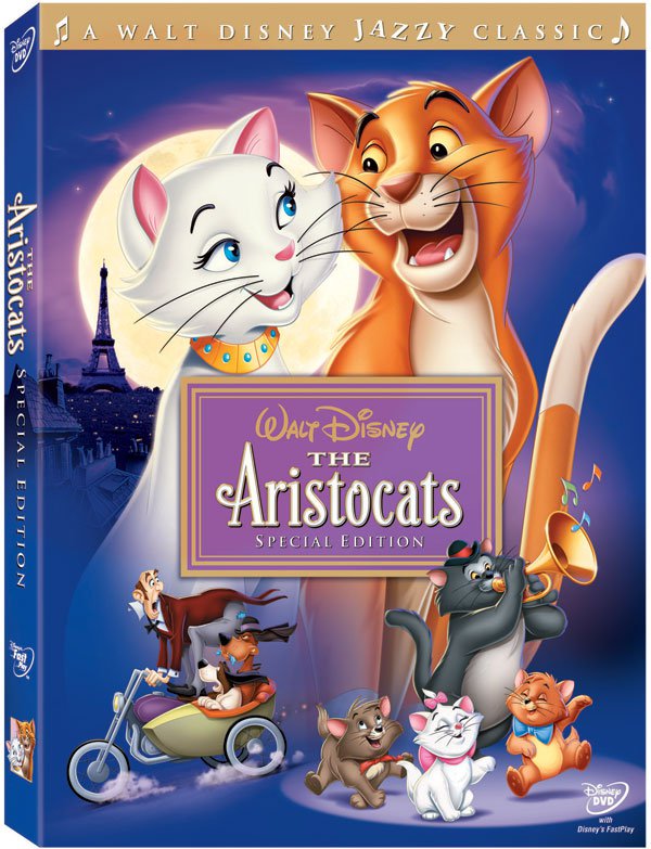
There has been an obnoxious trend that has been plaguing the animation industry for at least 20 years and does not seem to be going away any time soon, the misuse of color. Perhaps this has to do with the fact that animation is still primarily considered childern's entertainment here in the United States. Europe and Japan tend to avoid marketing their products with overly bright colors, appealing to a wider audience. In the US we are stuck with glossy photoshopped DVD covers that look nothing like nor have the subtlety of the original animation.

So how do these two images look alike?
This is even more sad/hilarious when more mature films are marketed this way.


It's about a mother mouse braving dangers to save her son from pneumonia and the wrongs of animal experimentation.
Some of you may be thinking, "Oh come on, it's not that bad. That's just how Disney markets princesses to little girls and kids like bright colors." If you still need convincing as to why this is a major issue, color saturation has began to affect major animated films and even the restorations of animated classics. Animator Hayao Miyazaki has been particularly critical of many of Disney's 'Special Editions.' He requests that his films are only digitally enhanced for clearer picture quality and do not have any film grain or mistakes removed.

Somewhere an animator is crying.


Animation from the original Rescuers (1977) versus the sequel (1990).
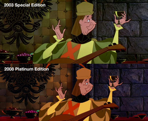
The 'Not-So Special' Edition
No comments:
Post a Comment