1. Snow White
Grim Natwick's first and finalized drawings of Snow White.
Besides animating Snow White and Betty Boop, Natwick also contributed to several other projects. He redesigned Woody Wood Pecker for Walter Lantz, animated Mickey Mouse in Fantasia, and helped with Robin William's ill-fated The Thief and the Cobbler, just to name a few. Natwick's contributions can not be understated. Since 2010 there has been a animation festival named after him, which is held an annually in Wisconsin Rapids, Wisconsin.
2. Jiminy Cricket
Early, more cricket-like sketches of Jiminy by Kimball.
Pinocchio (1940) was the second Disney feature film after Snow White and thus a lot of anticipation surrounded the project. Fortunately, the film proved to be just as, if not even more memorable than its preceder. This was due to its vastly improved animation, more complex plot, and fuller characters. Arguably, Jiminy Cricket is the best example of the later. The cricket originally appeared briefly in the story that the film was based off of, giving advice to Pinocchio only to be squashed. (Although, the cricket did appear later as a ghost.) Walt Disney saw potential in the character and decided to expand the his role and for him to act as Pinocchio's conscience.
Ward Kimball was given the job of designing Jiminy in order to make the cricket more appealing (and as sort of an apology from Walt for cutting a scene that Kimball animated for Snow White). Kimball, who would later become one of the most famous and respected animators who ever lived, found it very difficult to make such an 'ugly insect' cute. Kimball ended up settling with a character that hardly even looked like a real cricket, and more like a small man. Never the less, this did not matter. Kimball's excellent animation of the cricket, the character's appealing design, and portrayal by Cliff Edwards made Jiminy an unforgettable Disney icon.
3. Aurora
Early sketches of Aurora based off of Audrey Hepburn by Tom Oreb.
Mark Davis's finalized look for the character.
To many, Sleeping Beauty (1959) represents the pinnacle of hand drawn animation during the Golden Era at Disney. It had complex, varied animation and an uniquely inspired angular style, blending modernism with Medieval paintings (which was largely due to the genius of the background artist, Eyvind Earle). However, the film was not very well received when it first released. Although Sleeping Beauty was nominated an Academy Award for its score, the film drastically underperformed at the box office (only earning about $7.7 million for its six million production costs!) and the critics found it to be lacking in character development (To be fair, Disney leads, up until fairly recently, have generally been less interesting than the supporting cast.) Due to these factors, Walt would switch completely over to the Xerox process developed by Ub Iwerks to keep costs down for the rest of his films, and Disney would not make another fairytale feature again until The Little Mermaid in 1989.
The development of the princess Aurora (from the Latin word for "dawn", the same name used in Tchaikovsky's ballet) helps make sense of some of the difficulties Disney's ambitious, but troubled film. The original drawings for Aurora by Tom Oreb were heavily modeled off of Audrey Hepburn, who was at the height of her popularity at the time. Marc Davis, who had experience previously animating Cinderella and also animated Maleficent for Sleeping Beauty, modified Oreb's original idea so that Aurora could better fit in with Earle's stylized backgrounds, while still maintaing her willowy frame. Marc Davis's wife, Alice, designed Aurora's final costume and live action footage of actress Helene Stanley was used for reference purposes. Visually Aurora worked well in her film, but she had very little personality. Then again, Aurora is asleep for the vast majority of the film, only having screen time for about eighteen minutes, so this is not too surprising.
The development of the princess Aurora (from the Latin word for "dawn", the same name used in Tchaikovsky's ballet) helps make sense of some of the difficulties Disney's ambitious, but troubled film. The original drawings for Aurora by Tom Oreb were heavily modeled off of Audrey Hepburn, who was at the height of her popularity at the time. Marc Davis, who had experience previously animating Cinderella and also animated Maleficent for Sleeping Beauty, modified Oreb's original idea so that Aurora could better fit in with Earle's stylized backgrounds, while still maintaing her willowy frame. Marc Davis's wife, Alice, designed Aurora's final costume and live action footage of actress Helene Stanley was used for reference purposes. Visually Aurora worked well in her film, but she had very little personality. Then again, Aurora is asleep for the vast majority of the film, only having screen time for about eighteen minutes, so this is not too surprising.
4. Cruella De Vil
Cruella as she appears in the original book. Yes, there was a book.
Sexy Cruella?!
Now we are getting a bit closer.
Cruella in action, as we know her today.
Cruella as she appears in the original book. Yes, there was a book.
Sexy Cruella?!
Now we are getting a bit closer.
Cruella in action, as we know her today.
Arguably one of Disney's most famous villains, Cruella De Vil was another crowning achivement of Marc Davis's Career. No doubt, her presence and the modern setting of 101 Dalmatians (not to mention the puppies themselves), helped the film become a major success. This was especially relieving to the Disney staff after what had happened with Sleeping Beauty. Cruella Devil shows Marc Davis's skill at creating diverse and memorable personalities. Although Cruella is a villain like Maleficent, she is very different. Cruella is far more dramatic, flamboyant, vain, and in-your-face, whereas Maleficent is far more composed, cruel, and reserved. Cruella is so caricatured that she is very easy to laugh at, but also can come of as frightening if needed. And of course, the more nasty and ugly Cruella is, all the more cute and innocent the dalmatian puppies seem. Looking at the evolution of Cruella De Vil's character, it is certainly interesting to see how her design goes from being a cold and fashionable women, to being outright haggard and crazy!
"Cruella De Vil. Cruella De Vil. Just try to get this out of your head, you never will."
5. Prince John

Ollie Johnston's tiger Prince John.
Early drawing of the cast by Ken Anderson.
Prince John doing what he does best.

Ollie Johnston's tiger Prince John.
Early drawing of the cast by Ken Anderson.
Prince John doing what he does best.
Robin Hood, for better or for worse, was the first Disney film to not be approved by Walt (and the second to be produced without him, after The Aristocats), as he had died seven years earlier in 1966. Granted Walt did influence the production of the film by the decision of making a film related to, but not directly about the folk character Reynard the Fox (due to Walt finding Reynard too cruel to be likable). Reception for Robin Hood was initially mixed and the animation itself was made on a tight budget (resulting in retracing of several scenes from earlier Disney films) Today, the film has garnered a better reputation for its brand of humor and excellent performance of Prince John by Peter Ustinov.
Like in the Reynard tales, Disney's fox version of Robin Hood faces off against an inept ruler who happens to be a lion. Ollie Johnston originally planed for John to be a tiger, but his since his brother was King Richard 'the lion hearted', the idea was dropped. Prince John isn't even depicted with a mane like a healthy adult male lion. This is likely done as a knock on his inefficacy to rule, and his immature behavior. Interestingly enough, the film's climax was going to be different and would have made John somewhat more of a threat. The surviving storyboards, drawn by Ken Anderson, reveal that Prince John actually attempted to stab Robin Hood after he fell down into the moat.
Like in the Reynard tales, Disney's fox version of Robin Hood faces off against an inept ruler who happens to be a lion. Ollie Johnston originally planed for John to be a tiger, but his since his brother was King Richard 'the lion hearted', the idea was dropped. Prince John isn't even depicted with a mane like a healthy adult male lion. This is likely done as a knock on his inefficacy to rule, and his immature behavior. Interestingly enough, the film's climax was going to be different and would have made John somewhat more of a threat. The surviving storyboards, drawn by Ken Anderson, reveal that Prince John actually attempted to stab Robin Hood after he fell down into the moat.
Robin Hood's alternate ending!
6. Gurgi
Milt Kahl's suggestion for Gurgi.
Mel Shaw's apish Gurgi.
Andreas Deja's cleanup model of Gurgi.
Milt Kahl's suggestion for Gurgi.
Mel Shaw's apish Gurgi.
Andreas Deja's cleanup model of Gurgi.
The Black Caldron is widely regarded as one of Disney's biggest disappointments. It lacked interesting or relatable characters, scared away leery family audiences, and failed to capture the spirit of the books from which it was based off of. The film was meant to mark a major turn for Disney and was an early attempt of the studio to renew itself (which would not happen successfully until the late '80s with Who Framed Roger Rabbit? and The Little Mermaid.) The Black Caldron holds an interesting place in history however, as it marks many developments that would later be met with better results in Disney's subsequent films. It was the first Disney movie to use computer generated special effects and to receive a PG rating (which was truly a big deal back in the 1980s). The Black Caldron was one of the earliest Disney films to have no direct involvement from the famous Nine Old Men, thus an entirely newly crop of animators used the film as their training ground.
Andreas Deja, who would later become one of Disney's most acclaimed Renaissance era animators (He also has an excellent blog on animation history!), was given his first major assignment for The Dark Caldron. He animated Gurgi, the ever hungry, comedic canine-like creature and sidekick of the film's hero. Deja with some help from senior animator, Milt Kahl, managed to create some truly memorable scenes with this little misfit dog-man, in an otherwise fairly dull movie. From Kahl's original drawings and Mel Shaw's suggestions, Deja took the initial design of Gurgi and refined the character making him 'cuter' and more of his own vision.
Andreas Deja, who would later become one of Disney's most acclaimed Renaissance era animators (He also has an excellent blog on animation history!), was given his first major assignment for The Dark Caldron. He animated Gurgi, the ever hungry, comedic canine-like creature and sidekick of the film's hero. Deja with some help from senior animator, Milt Kahl, managed to create some truly memorable scenes with this little misfit dog-man, in an otherwise fairly dull movie. From Kahl's original drawings and Mel Shaw's suggestions, Deja took the initial design of Gurgi and refined the character making him 'cuter' and more of his own vision.
7. Ariel
An early sketch by Dan Haskett.
Another Haskett drawing. It's closer to the current design.
Glen Keane's Ariel, as we know her today.
An early sketch by Dan Haskett.
Glen Keane's Ariel, as we know her today.
An animated adaptation for The Little Mermaid had long been on Disney's back burner. But the idea did not catch on until long after Walt's death. Needless to say, the wait to get the story on the screen did not turn out to be a bad thing. The Little Mermaid ushered Disney into its second golden age and broke box office records. The movie required some of the most detailed and expensive animation since Fantasia (1940), and the end of the film was the first to use the CAPS digital coloring system (which was developed alongside Pixar, hinting at the future dominance of CGI in American film.)
The heroine of the film was designed by Disney's most famous living animator, Glen Keane (who left the company about a year ago). Ariel came into being when co-director Ron Clements decided that the character from the original story had to be rewritten to suit the film's audience. Dan Haskett's initial idea for Ariel was then handed over to Glen Keane to refine. Glen Keane apparently based Ariel's looks off of his own wife and the actress Alyssa Milano. Interestingly enough, Ariel was going to be blond, but it was ultimately decided that red would work better to stand out against the film's backgrounds and her green fins. Although the reception of Ariel's personality has been mixed, (some seeing her as a rebellious role model for young girls while others see her as a ditzy, lovestruck, and naive), the character has always been popular with audiences.
The heroine of the film was designed by Disney's most famous living animator, Glen Keane (who left the company about a year ago). Ariel came into being when co-director Ron Clements decided that the character from the original story had to be rewritten to suit the film's audience. Dan Haskett's initial idea for Ariel was then handed over to Glen Keane to refine. Glen Keane apparently based Ariel's looks off of his own wife and the actress Alyssa Milano. Interestingly enough, Ariel was going to be blond, but it was ultimately decided that red would work better to stand out against the film's backgrounds and her green fins. Although the reception of Ariel's personality has been mixed, (some seeing her as a rebellious role model for young girls while others see her as a ditzy, lovestruck, and naive), the character has always been popular with audiences.
8. Jafar
Thank heavens they didn't settle for this one.
Jafar continues to evolve...
Concept art by Daan Jippes.
Deja shows off Jafar's various expressions.
Thank heavens they didn't settle for this one.
Jafar continues to evolve...
Concept art by Daan Jippes.
Deja shows off Jafar's various expressions.
Directors Ron Clements and John Musker struck gold again with Aladdin (1992), and Andreas Deja also meet great praise for creating Jafar, easily one of Disney's most recognizable Renaissance era villains, alongside Scar (whom Deja also animated). Like all of Aladdin's other characters, Jafar's angular look was inspired by a distinct geometrical shape. (Speaking of angular, the fact that Deja over exaggerated Jafar's long face certainly leant to the character having many funny expressions!) Unlike the rest of the cast, however, Deja chose not to base Jafar of off the caricatures of Al Hirschfeld, in order to create a sense of contrast. Jafar's lean figure and pointed features were more similar in appearance to Maleficent from Sleeping Beauty and Zigzig from The Thief and the Cobbler. (Jafar also bears an uncanny resemblance to the villain Jaffar, played by Conrad Veidt, from the 1940 film The Thief of Baghdad, which was a major influence on Aladdin.)
9. Jane Porter
Another of Siepermann's drawings.
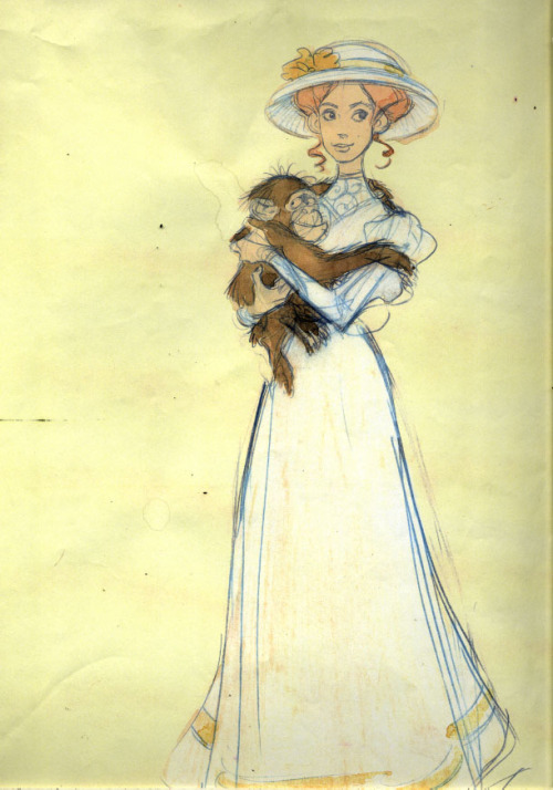
Ken Duncan's Jane is far less reserved!
Siepermann's initial sketches.
Another of Siepermann's drawings.
Tarzan (1999) is widely regarded as the last major film of Disney's Renaissance era. While the film's lead was animated by Glen Keane, Tarzan's love interest, Jane, was not interestingly enough. Some of Jane's earliest concept art was provided by the talented and late Harald Siepermann. Ken Duncan, who previously supervised the animation of Thomas from Pocahontas (1995) and Meg from Hercules (1997), was in charge of animating Jane Porter. His female leads are quite distinct from Glen Keane's girls. Their faces are far more angular, their eyes aren't so large, and they are overall more 'cartoony' than Keane's more youthful figures. (Duncan's ladies also seem to be a bit more vocal than Keane's female characters.) Apparently, much of Duncan's visual inspiration comes from studying popular female actresses of the 1940s. Notice how Jane's appearance changes over the span of these drawings from being snobbish / aloof to being more playful and goofy.
10. Stitch
Stitch in 1985.
Stitch in 1985.
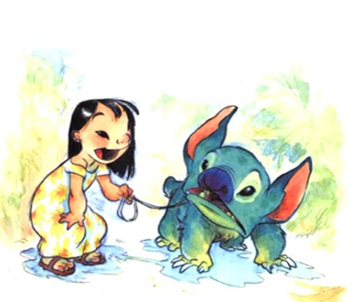
Bulldog Stitch?
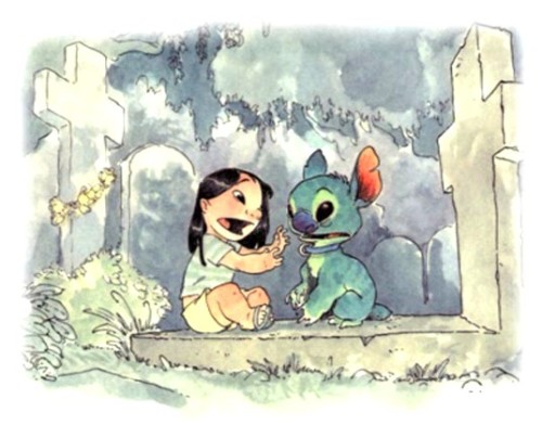
Stitch gets a bit cuter.
Stitch's model sheet.
For a Disney film, Lilo and Stitch (2002) was rather unconventional. Chris Sander's movie was not based off of a fairytale or popular childern's book. It was an entirely original concept. Lilo and Stitch was also set in present day, utilized water color backgrounds, and all of the major character designs came from Sanders himself. Stitch himself has a longer history than many people realize. The idea of a mischievous little alien becoming part of a family dates back to 1985, when Sanders attempted to pitch the character as an idea for a picture book. It was later decided for the film to take place in Hawaii because no other animated feature had been set there before. Chris Sanders even voiced Stitch himself. He would later leave Disney following a stint over the feature American Dog (which would eventually become Bolt [2008]), and go on to direct How To Train Your Dragon (2010) and The Croods (2013) for Dreamworks.


This comment has been removed by the author.
ReplyDeleteInteresting look at the history here! For sports enthusiasts, apps like cbtf turbo 247 keep you on top of every IPL and ICC match without missing a beat
ReplyDeleteFor a well-balanced and optimized platform, many users rely on Tiger exchange 365 due to its consistent performance and accessibility.
ReplyDeleteallpanelsexch.com is widely recognized for its secure system, user-friendly interface, and consistent performance across different devices.
ReplyDelete